ROLE: ART DIRECTION | BRANDING | GUIDELINES | EMAIL
ADT Security
BRAND FOCUSED CREATIVE
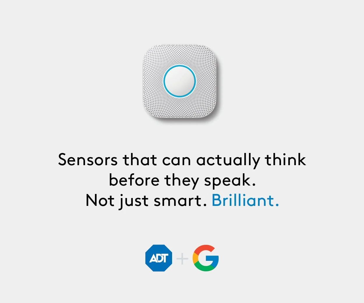
Played a key role in ADT’s brand evolution during the ADT+ launch with Google from bridging product, marketing, social media, and motion to create a cohesive, future-facing visual ecosystem.
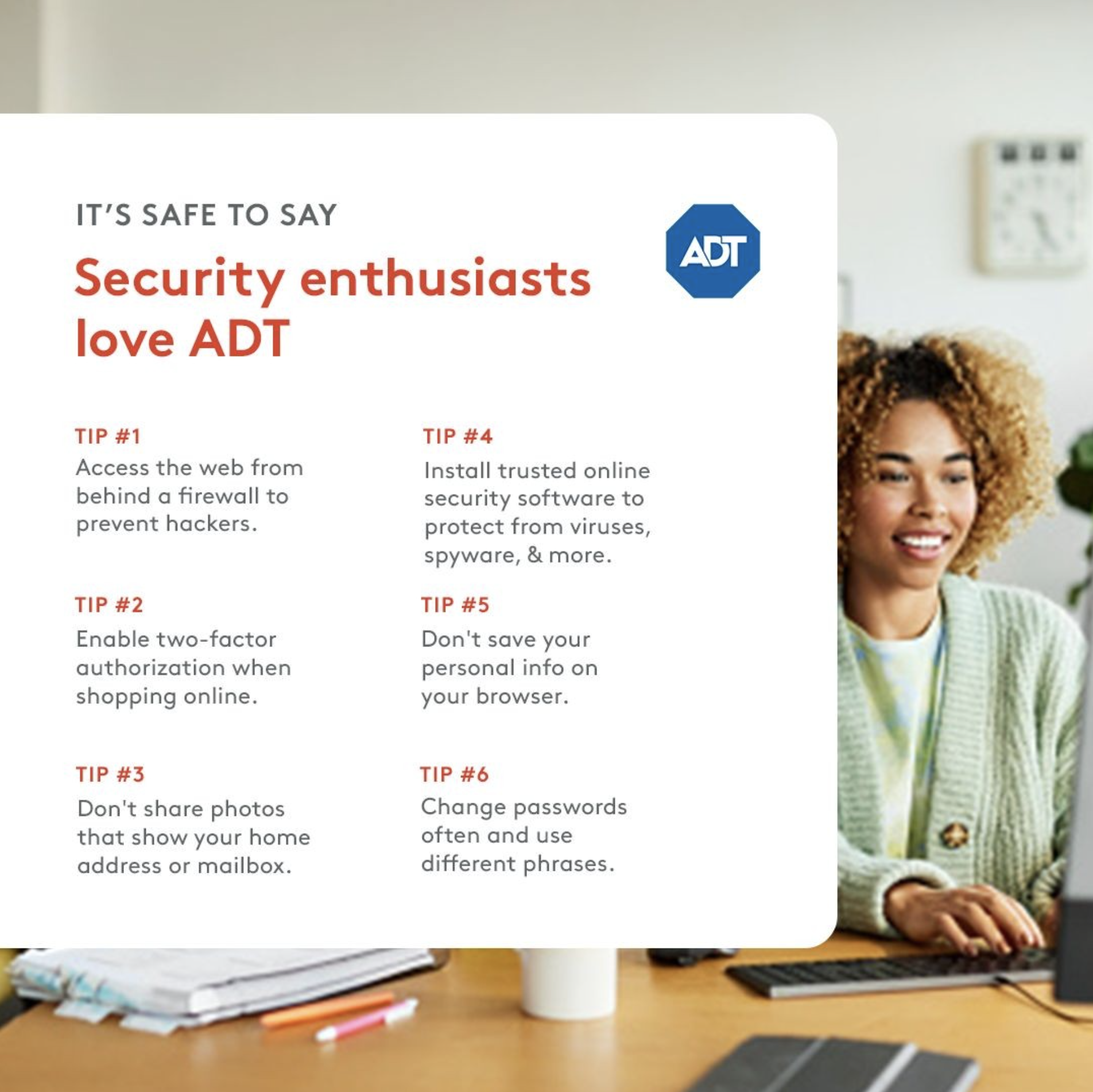
Beyond systems work, I conceptualized and executed a test campaign that helped shape and validate the direction for ADT’s national “Brilliantly Safe” campaign, influencing the final creative rollout. I also authored comprehensive email design guidelines to unify lifecycle communications, ensuring consistency, accessibility, and efficiency across cross-functional teams.
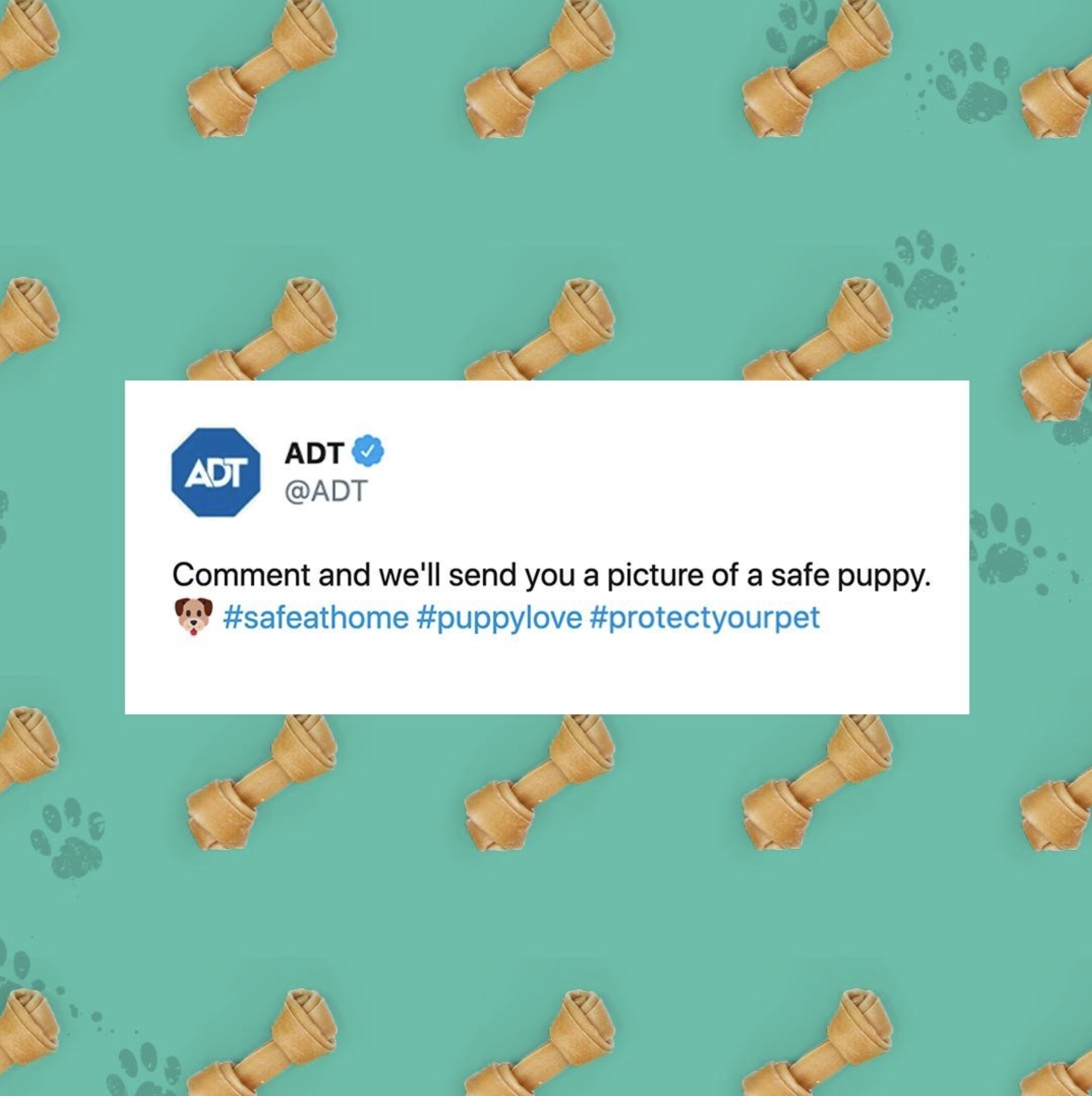
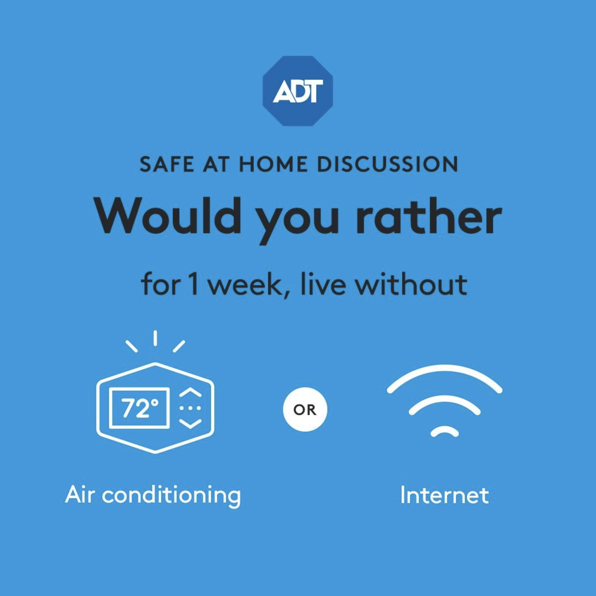
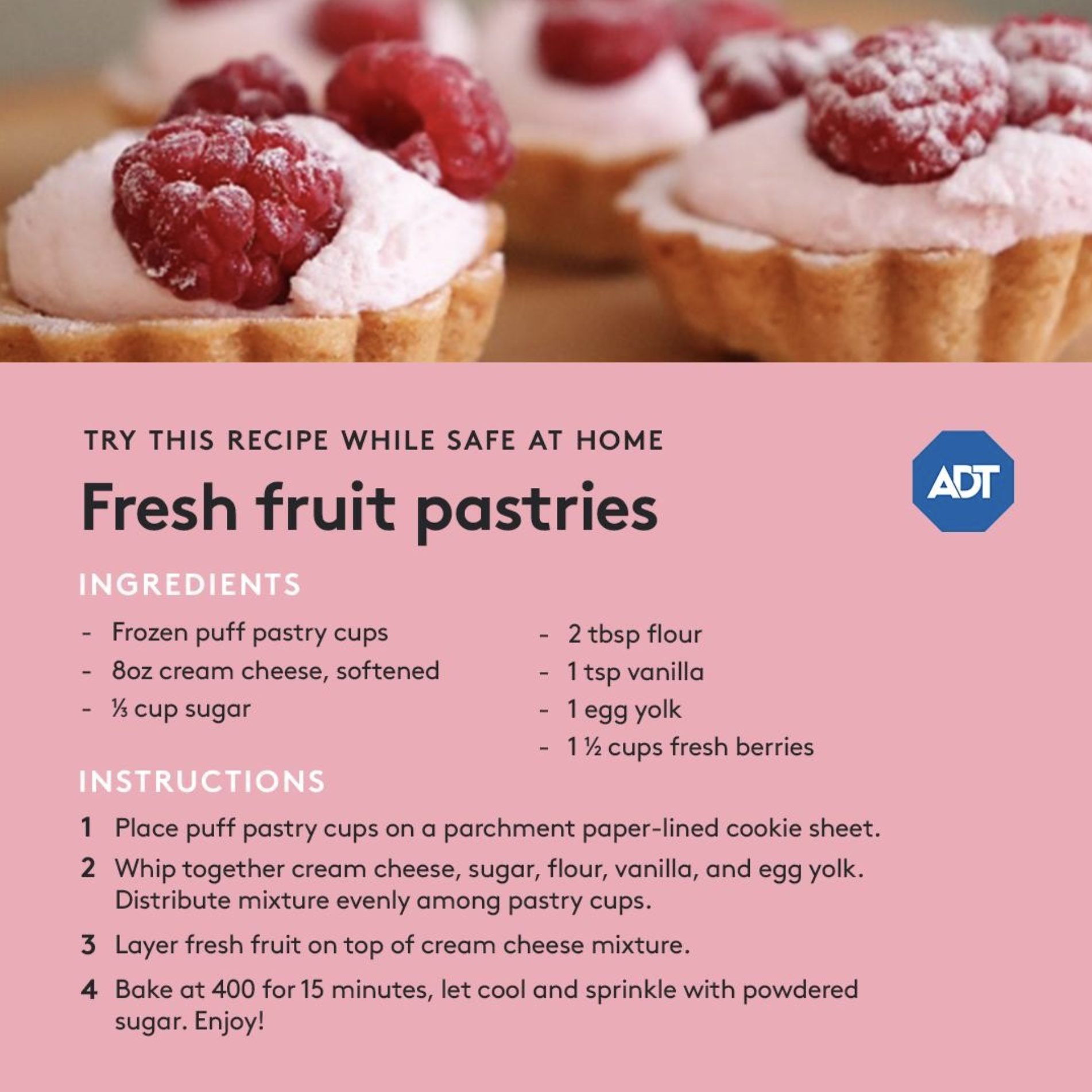
ADT SOCIAL | SAFE AT HOME CAMPAIGN
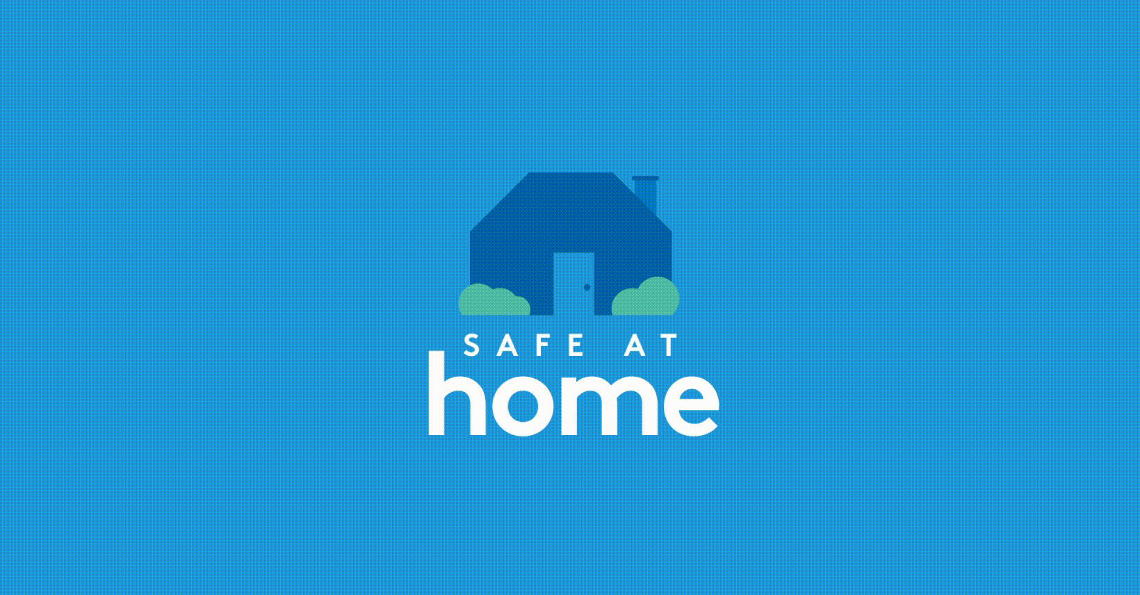
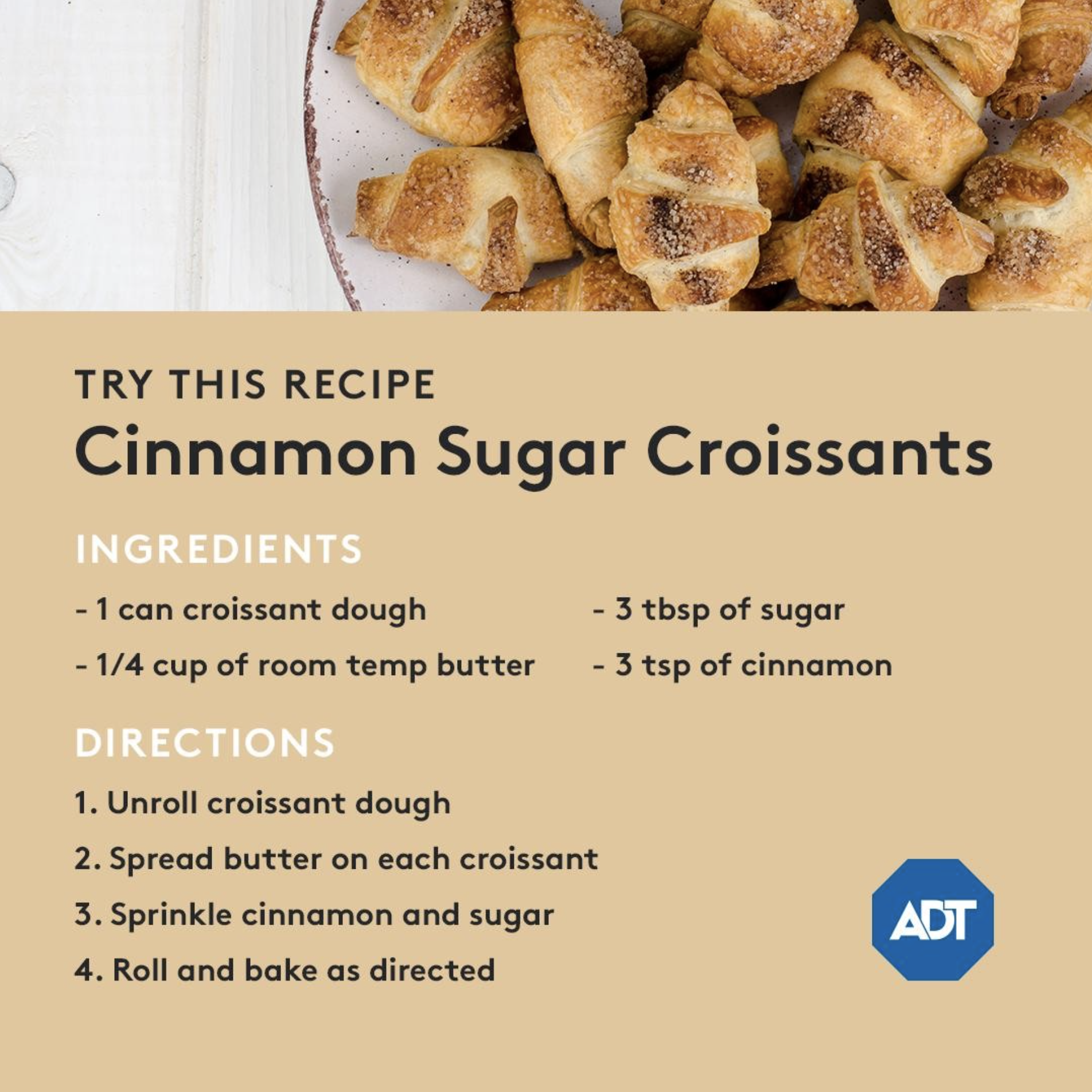
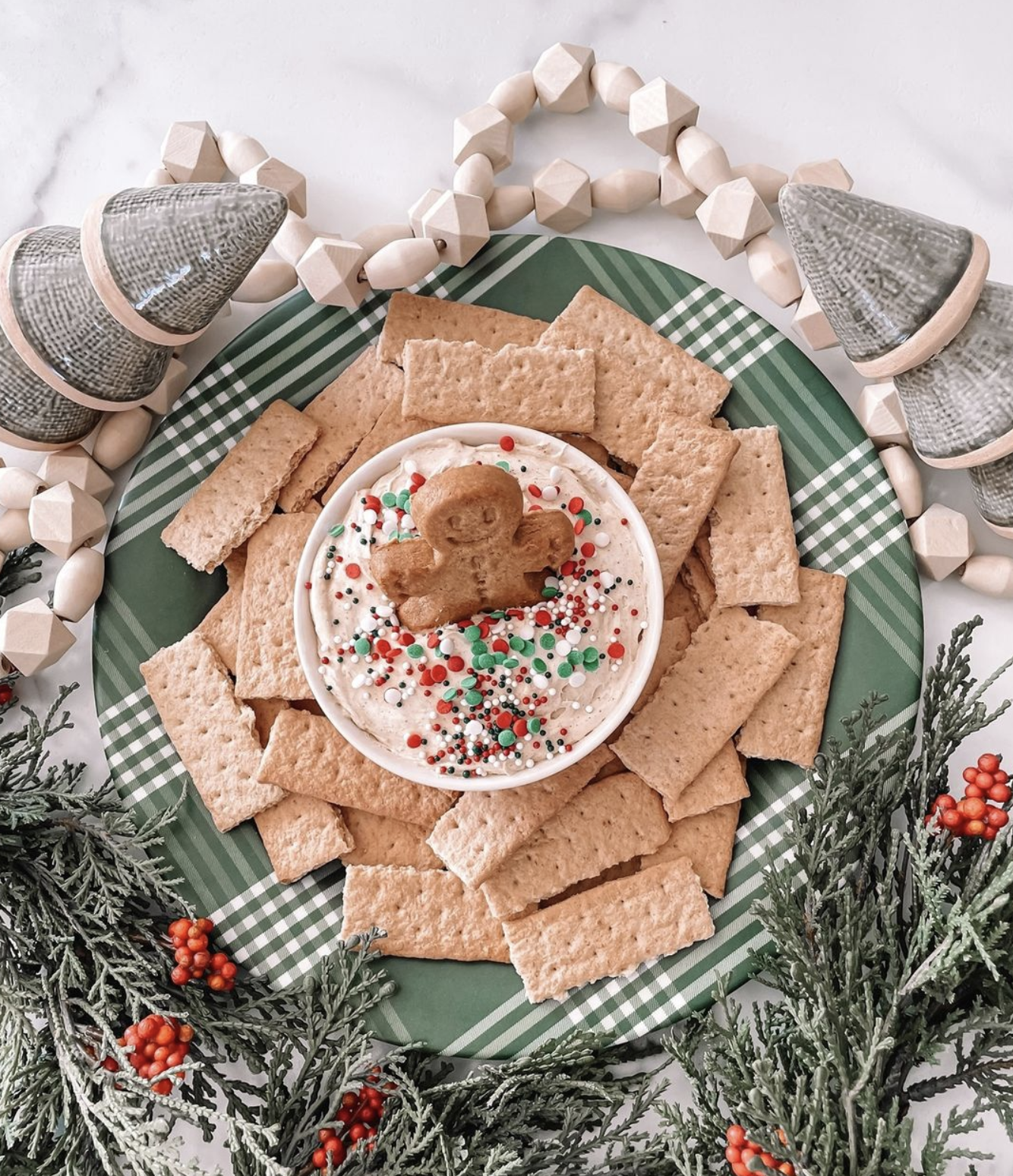
As families globally began to stay indoors during the COVID pandemic in 2020, ADT launched a digital, social-first campaign that would encourage audiences to stay safe and at home. We curated a thoughtful and strategic collection of social content that shared recipes, activities, and discussions to help maintain some level of normalcy during lockdowns.
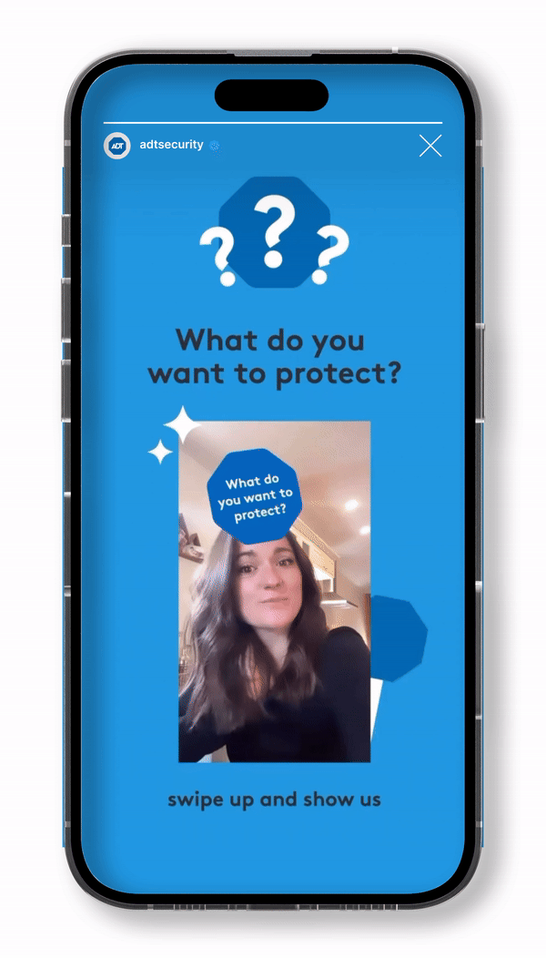
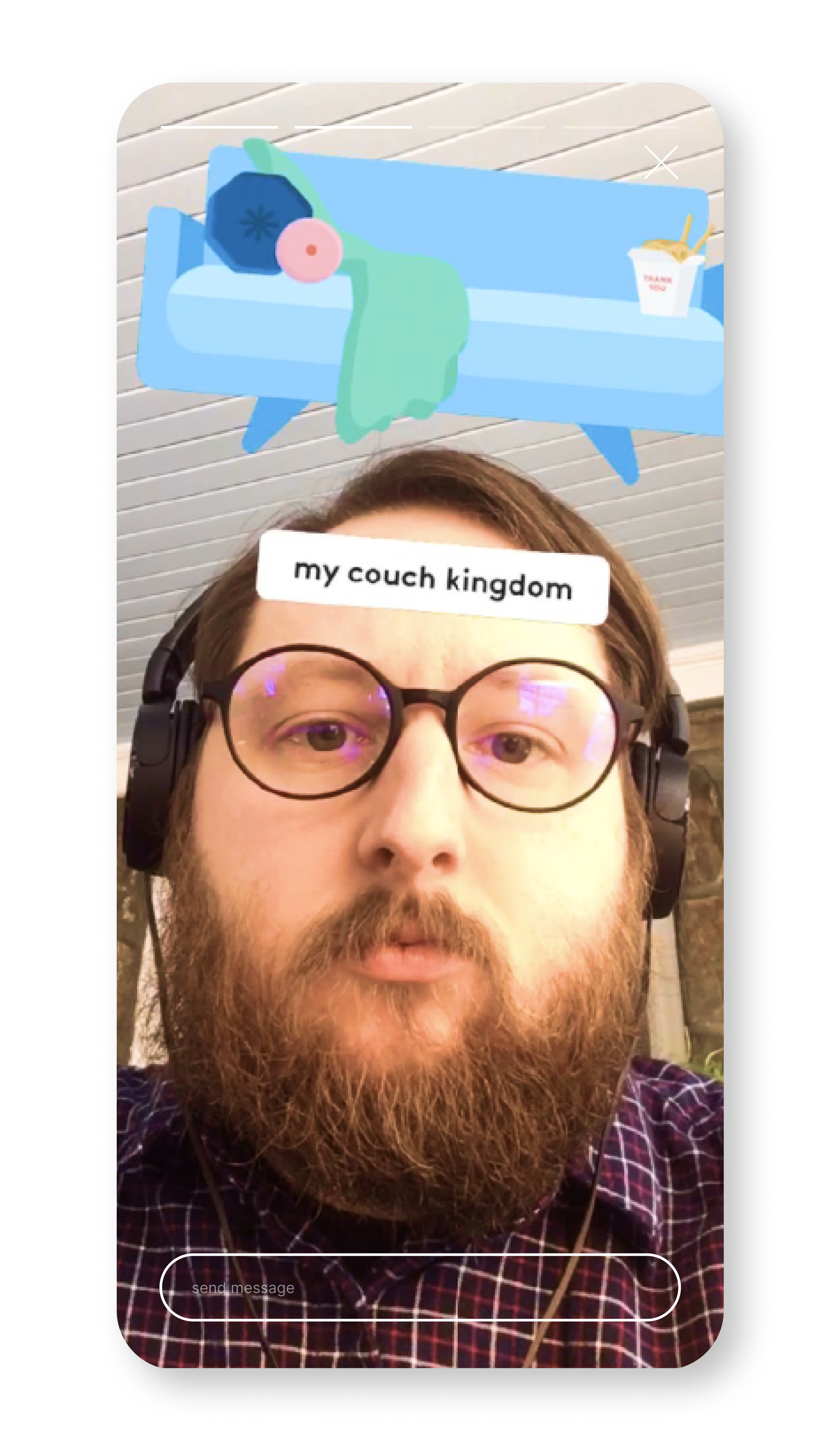
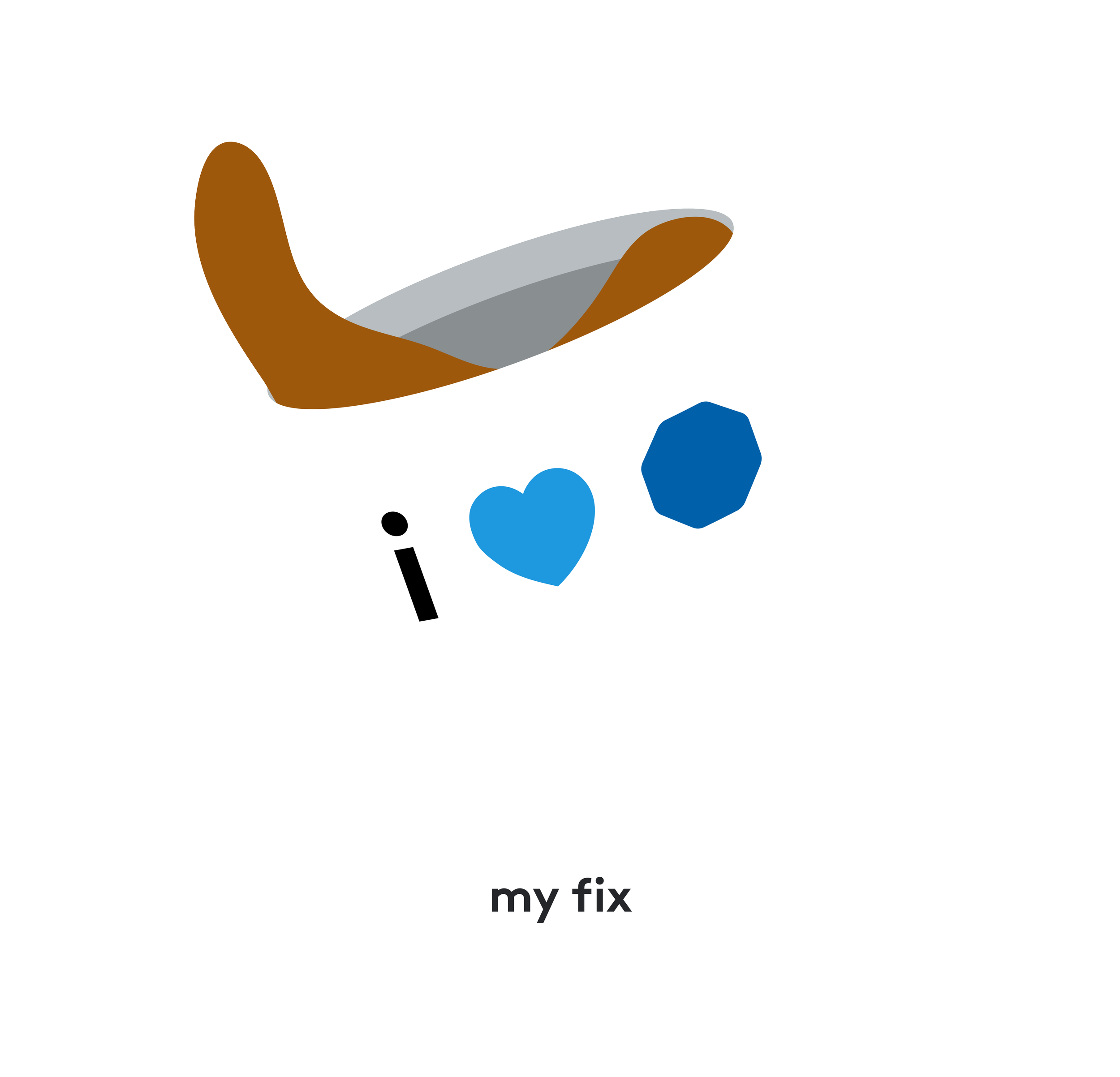
One of our first biggest activations? A fun, interactive filter I developed that received over 18,000+ impressions and 1,000+ captures within the first 24 hours. This filter specifically catered to our long-standing, reason-to-believe motto, “What Do You Want To Protect?“, which featured funny to heartwarming illustrated answers that won the hearts of thousands.


INFLUENCER ACTIVATION
IN-FEED CONTENT


And to take social creative fun to the next level and entice audience to tag us, I led the launch of ADT’s Official GIPHY Library.


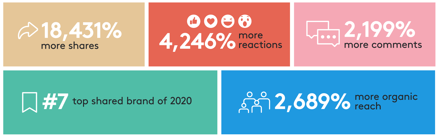
Read more about our Shorty Awards Here
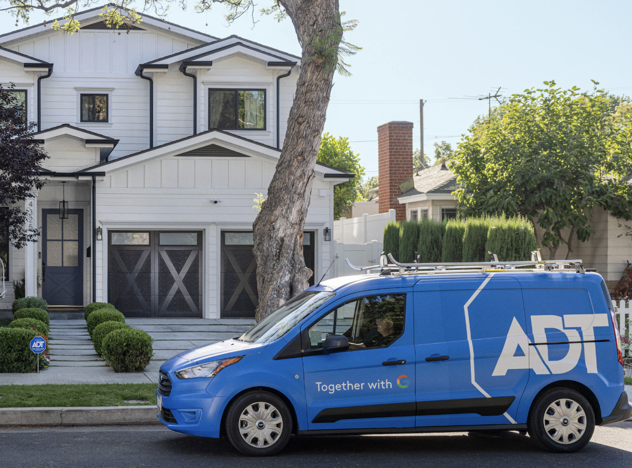
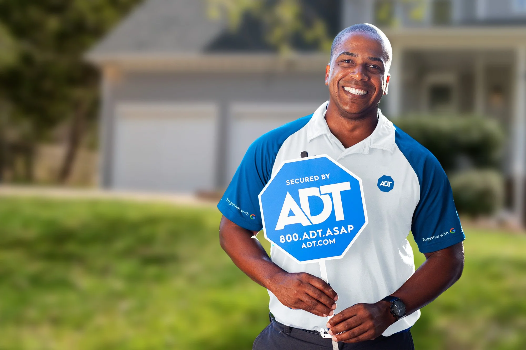
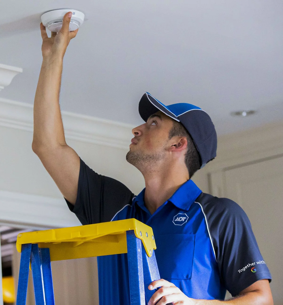
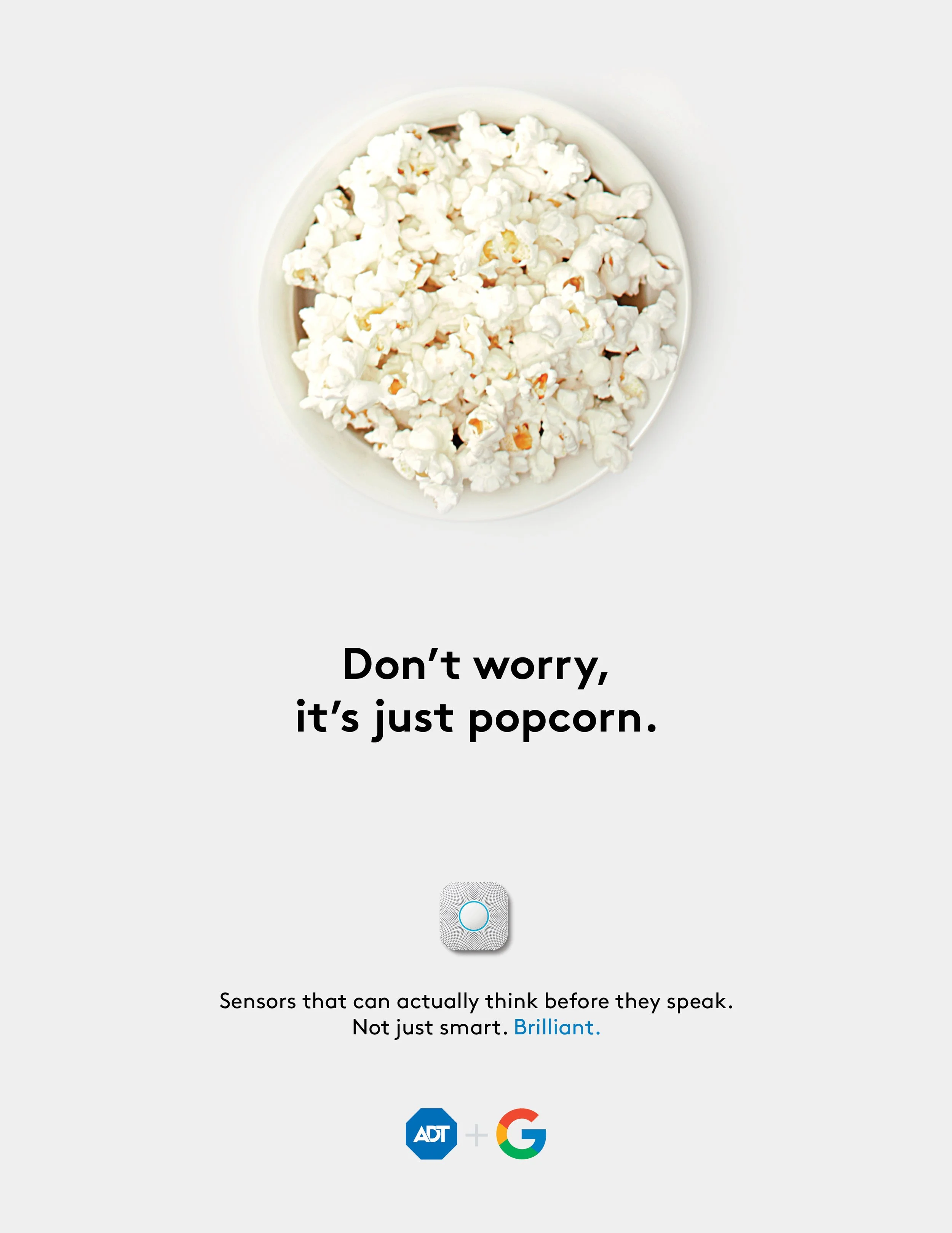
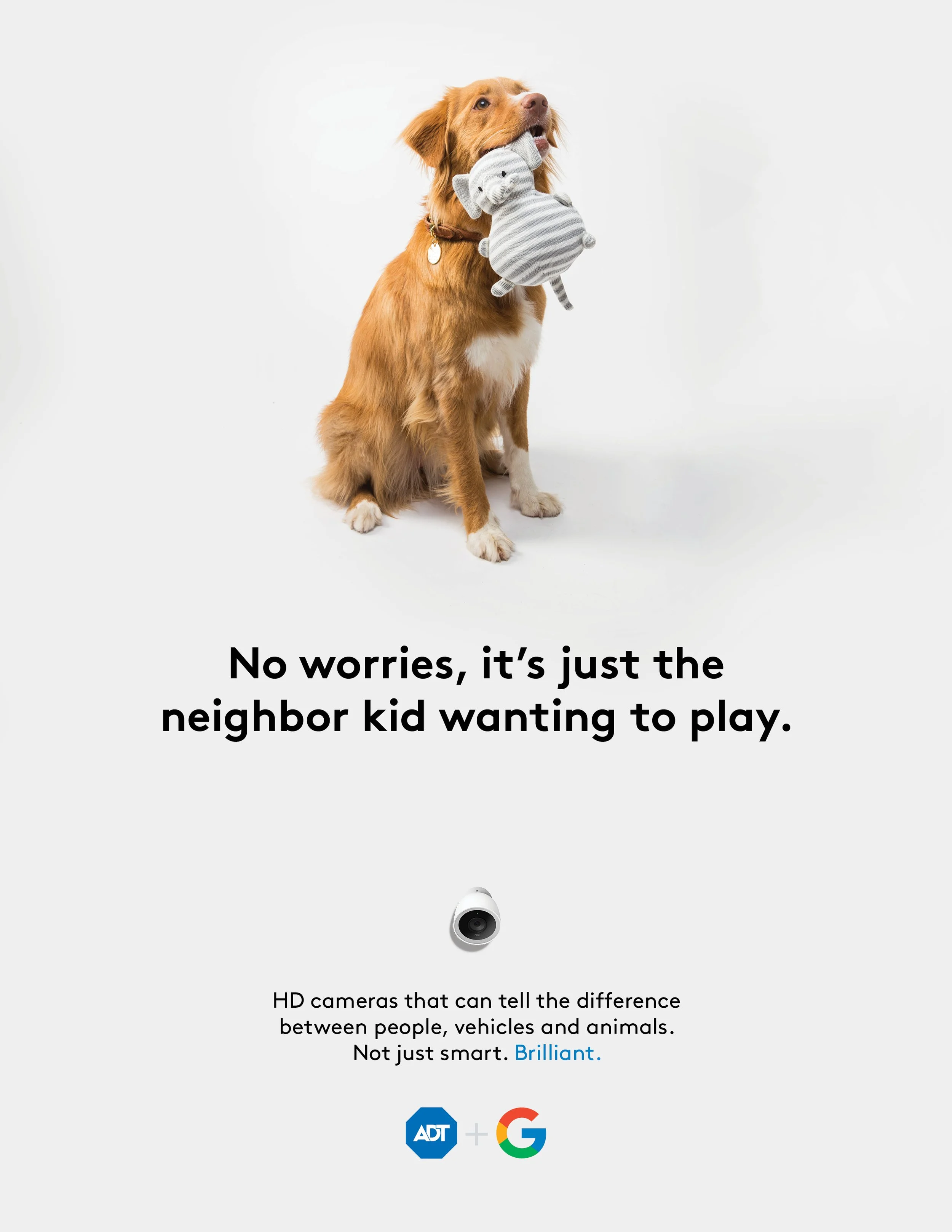
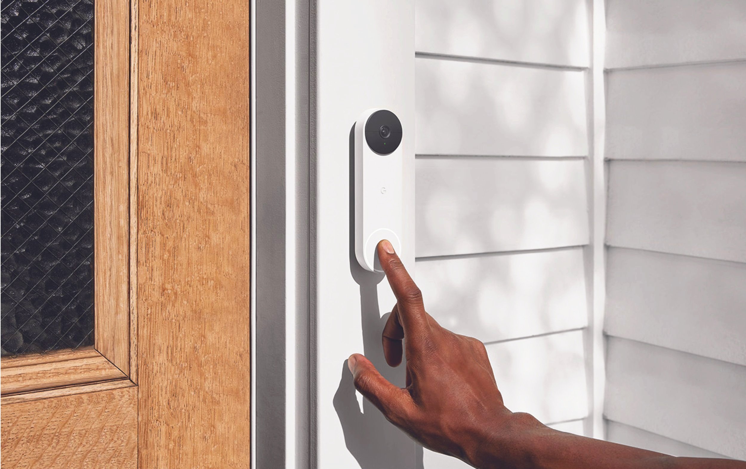
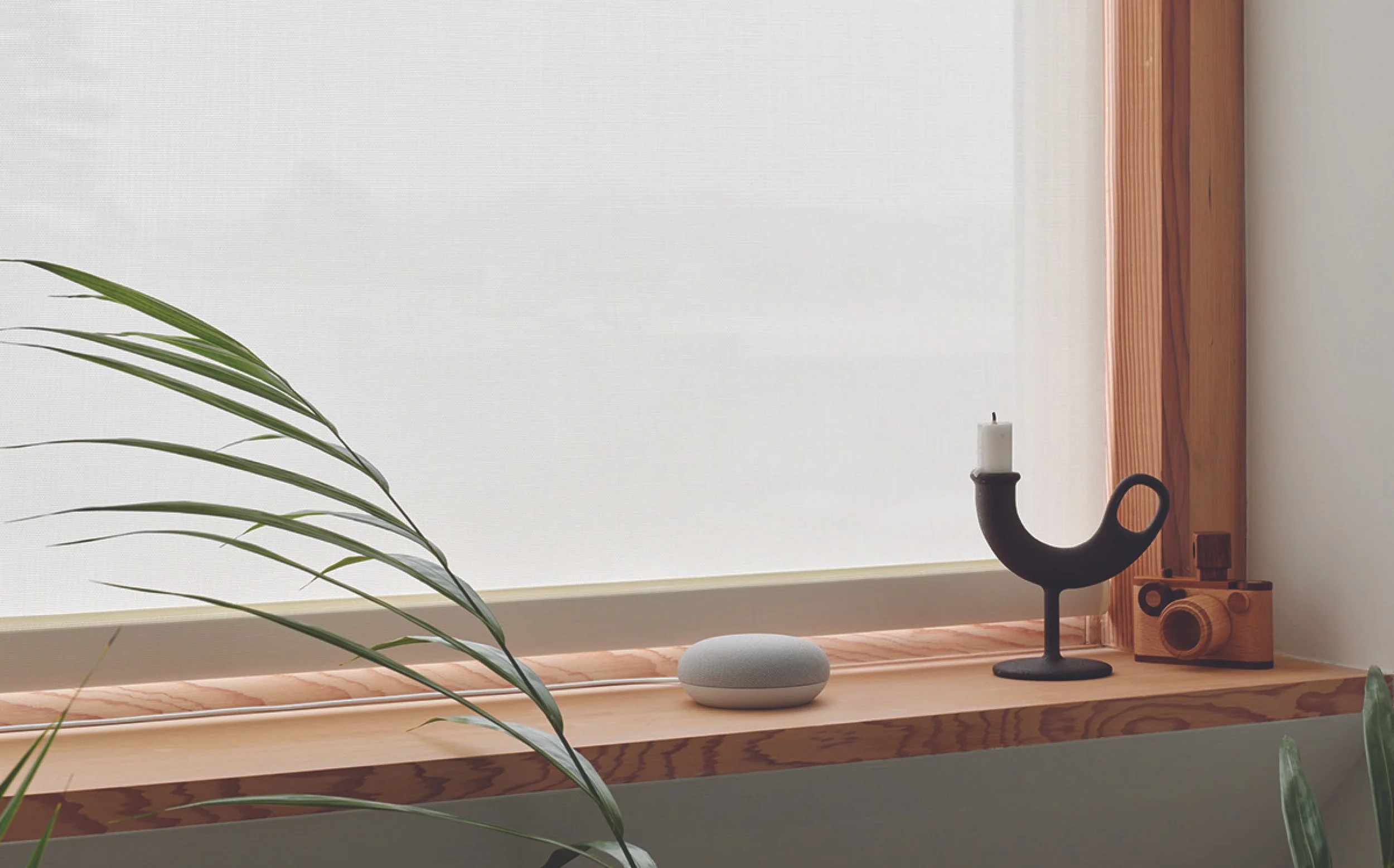
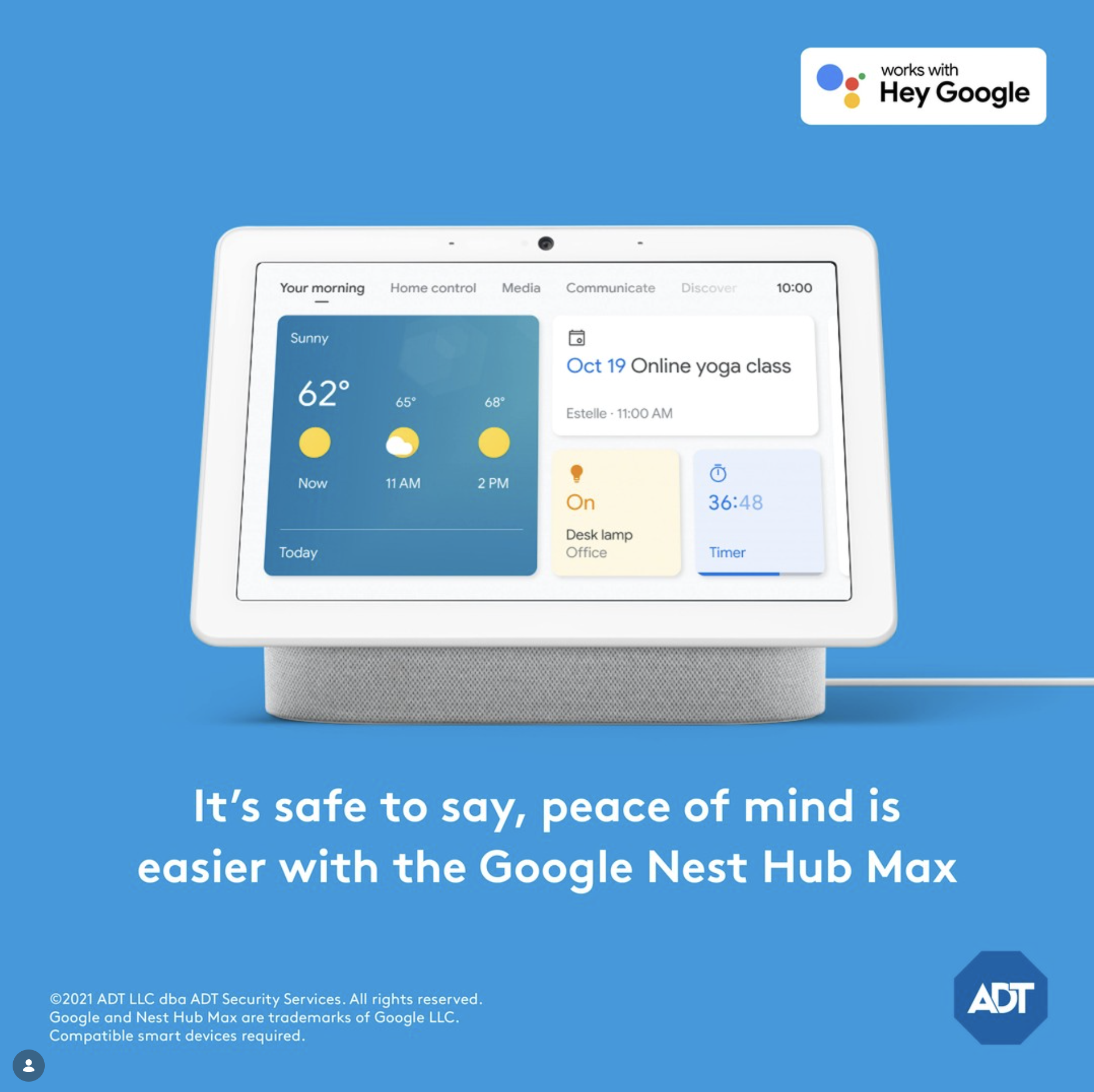
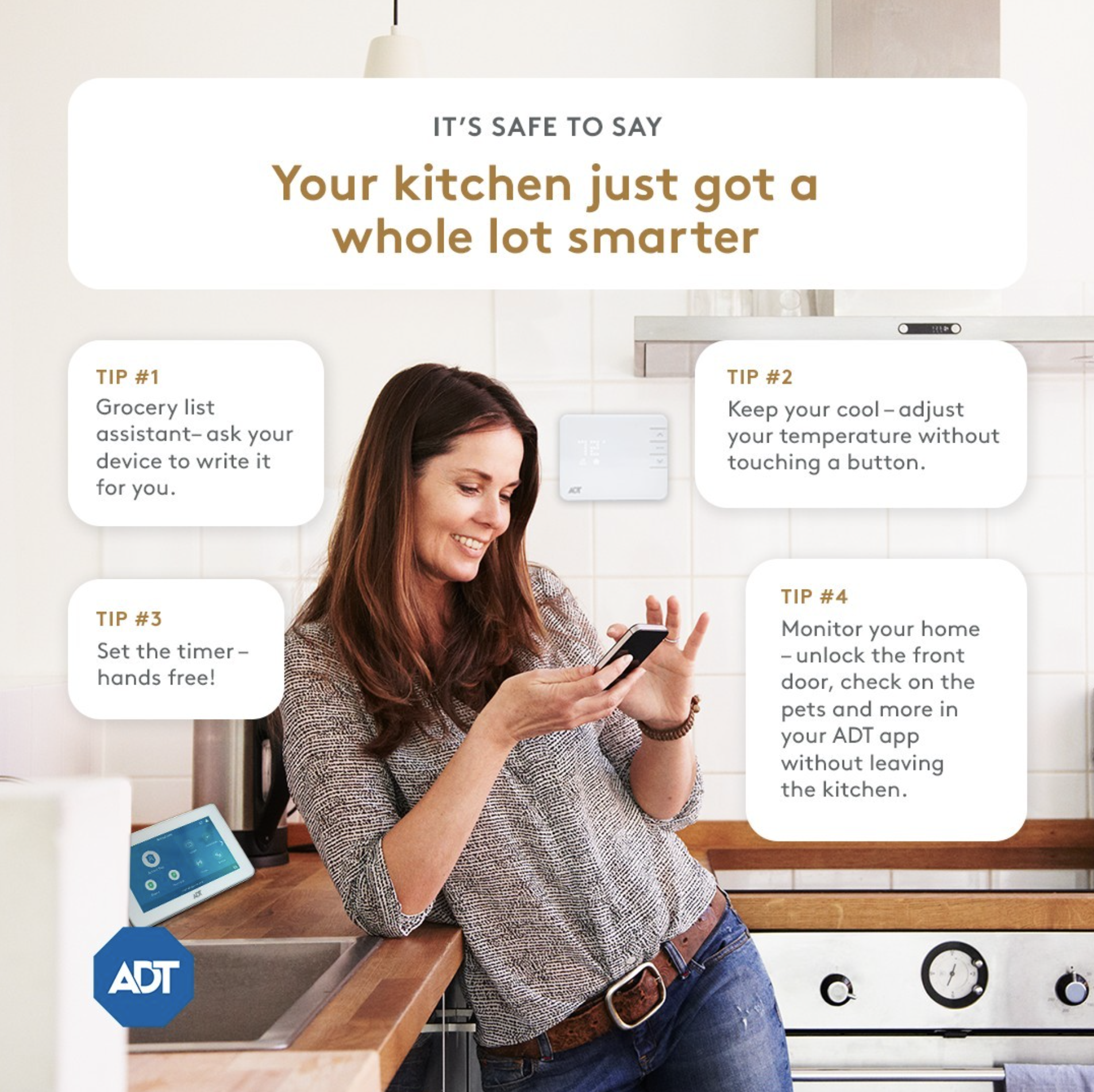
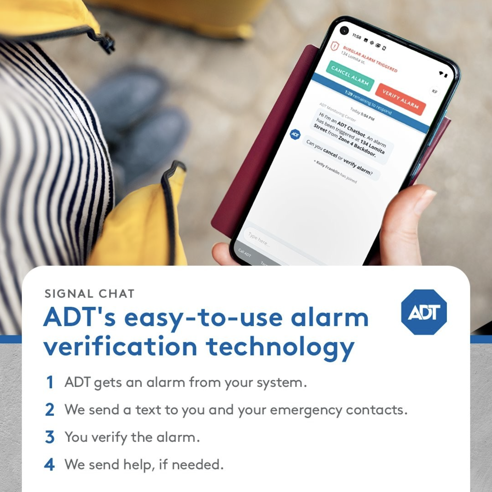
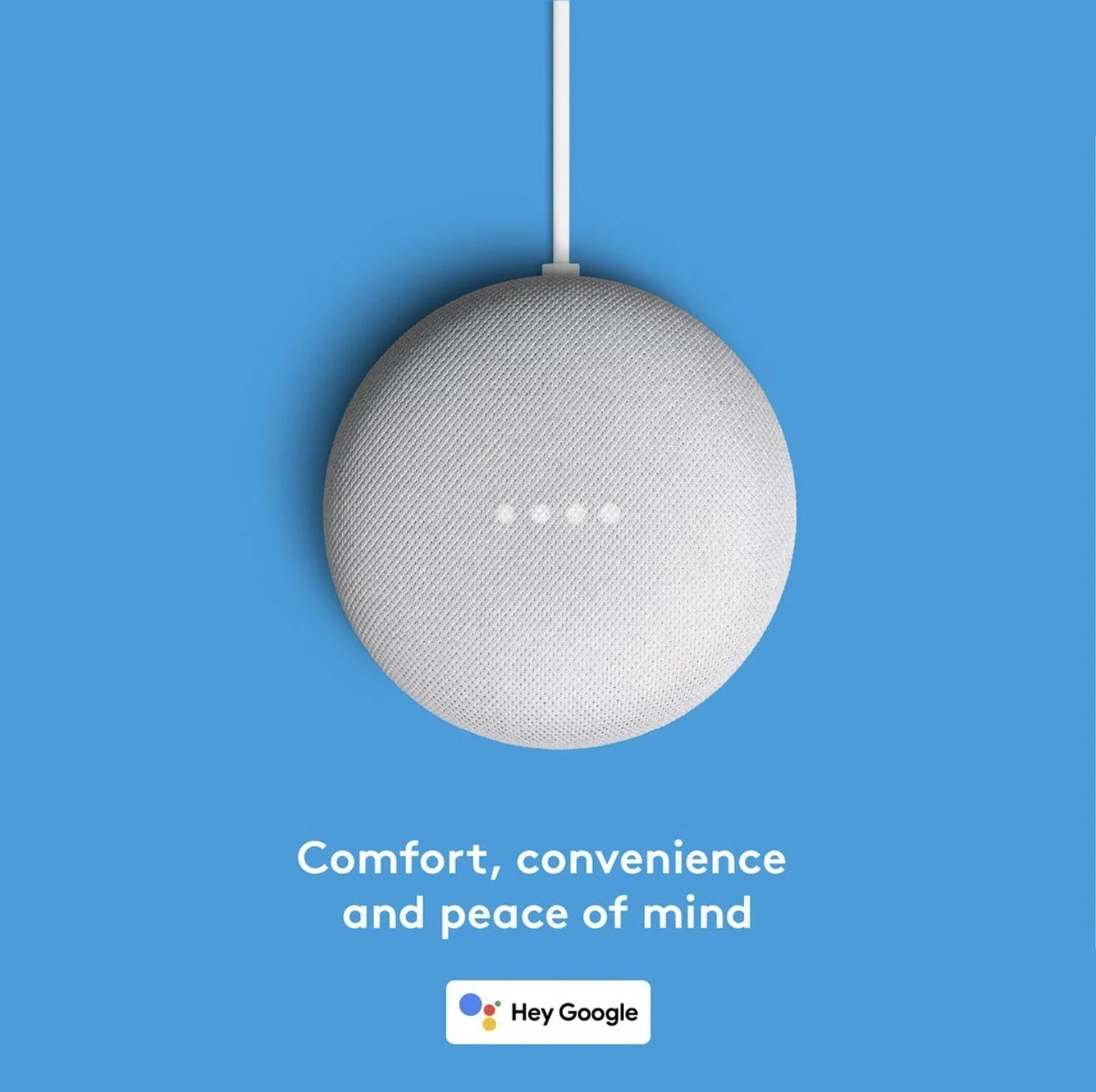
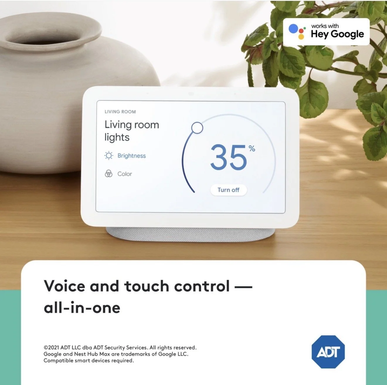
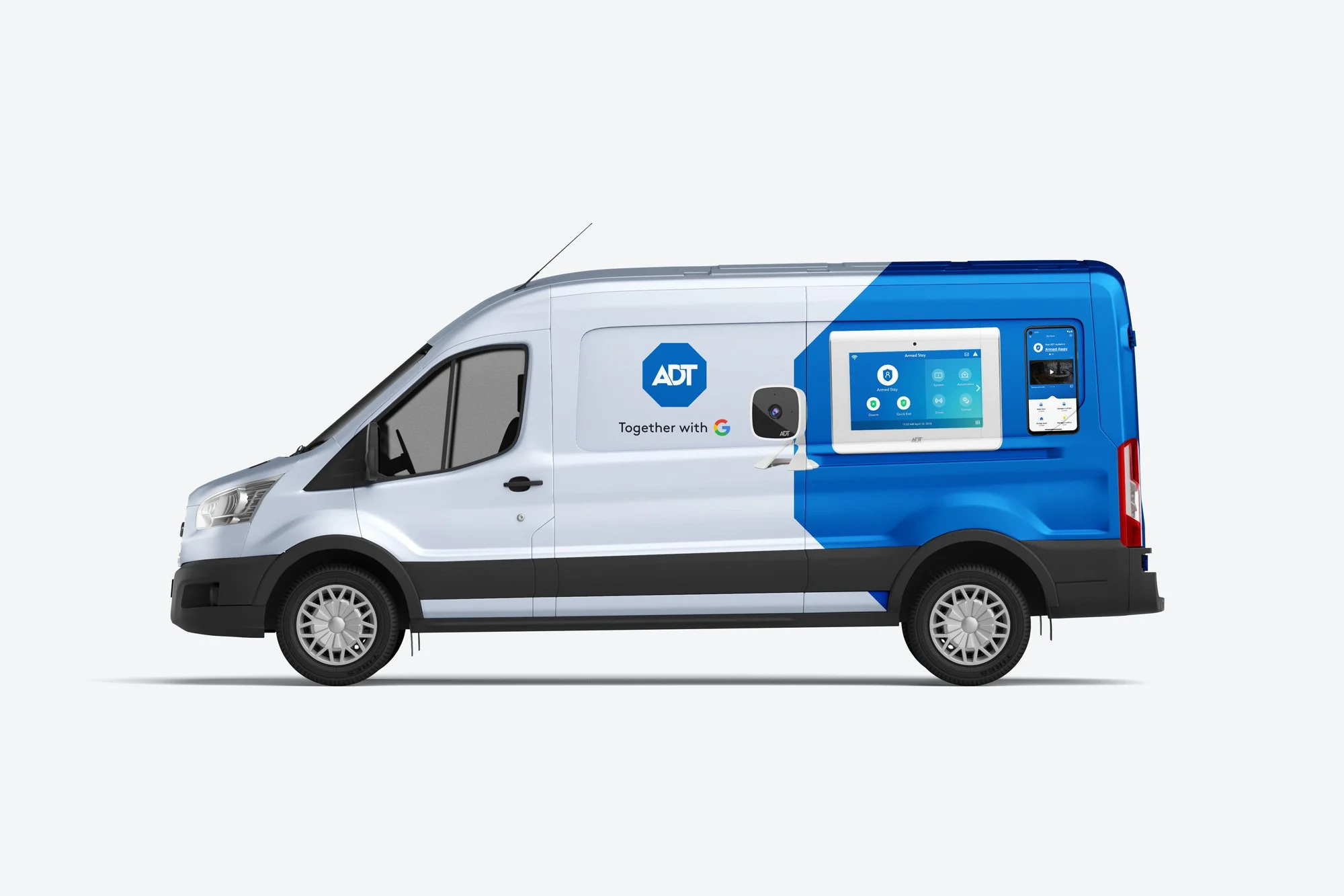
ADT + GOOGLE | LAUNCH + REBRAND
With the partnership of ADT + Google, I played a key role in spearheading the redesign of the partnership guidelines and their application on multiple channels such as print, digital, social, video, and app experiences. I led the implementation of user experience design fundamentals to improve overall aesthetic appeal and functionality to all digital marketing media.
DISPLAY + PRINT


SOCIAL
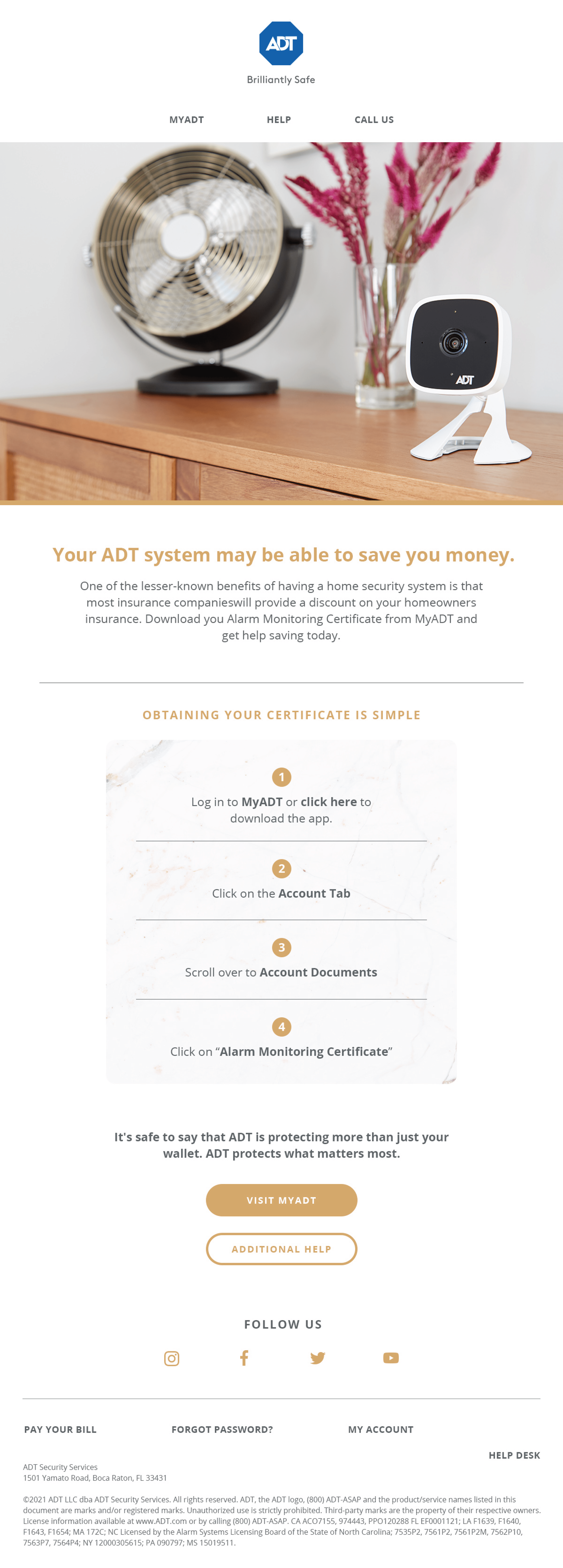
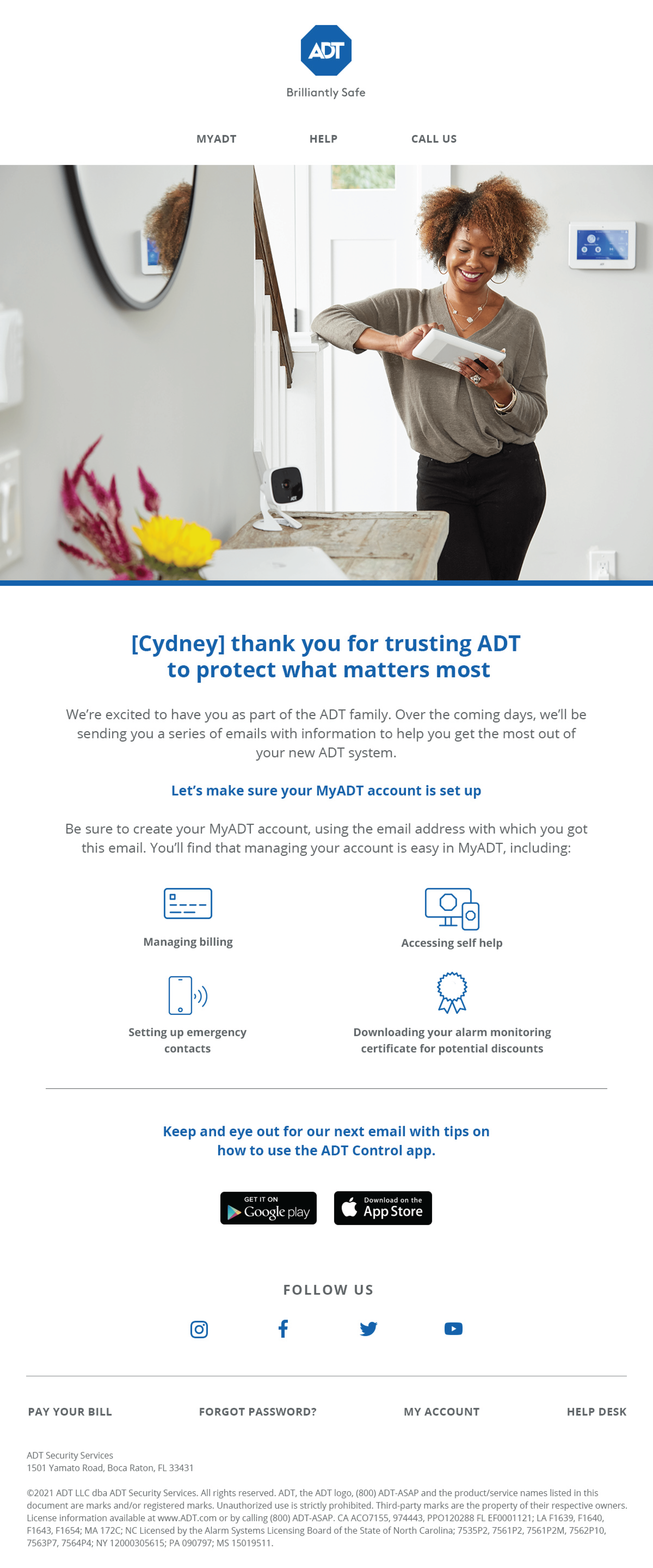
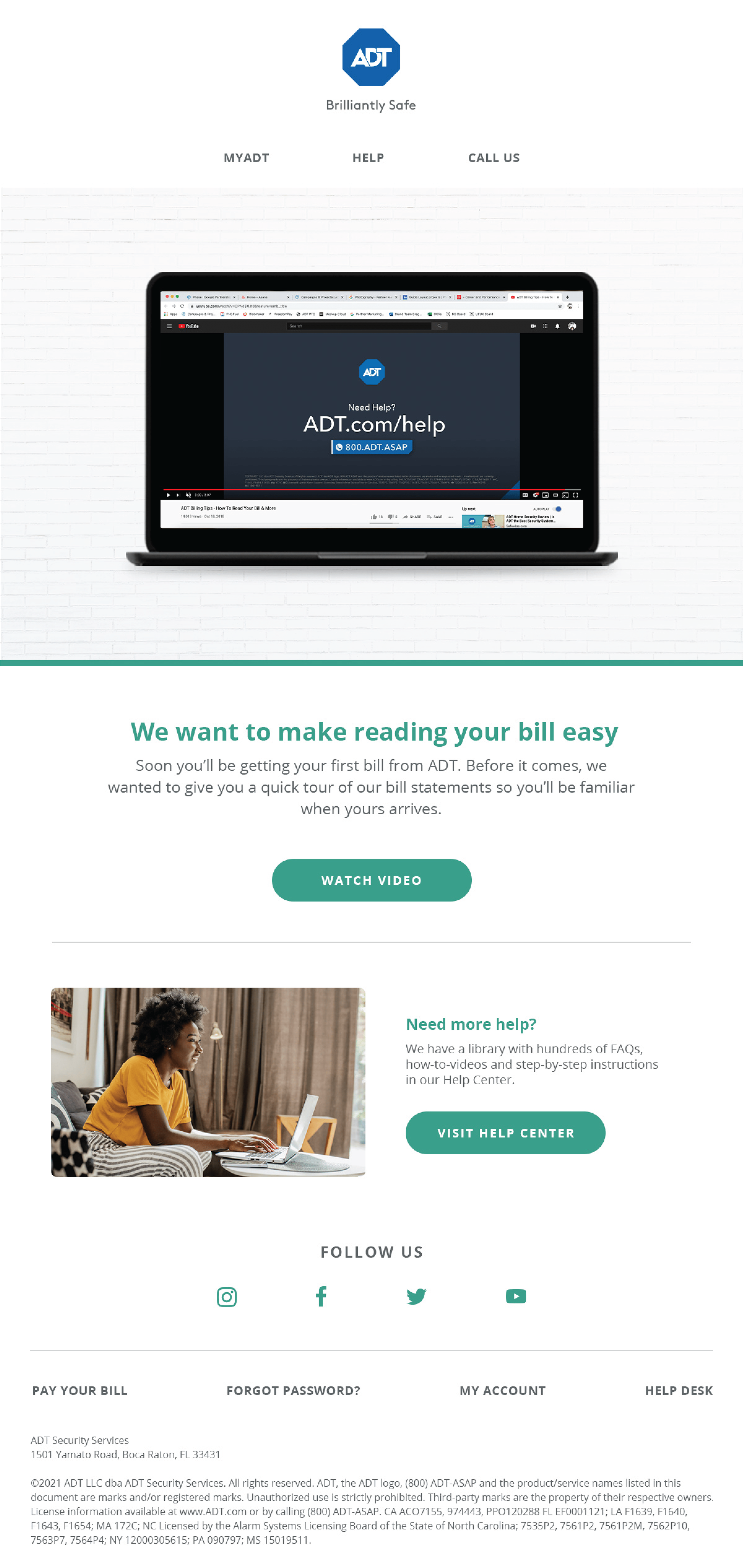
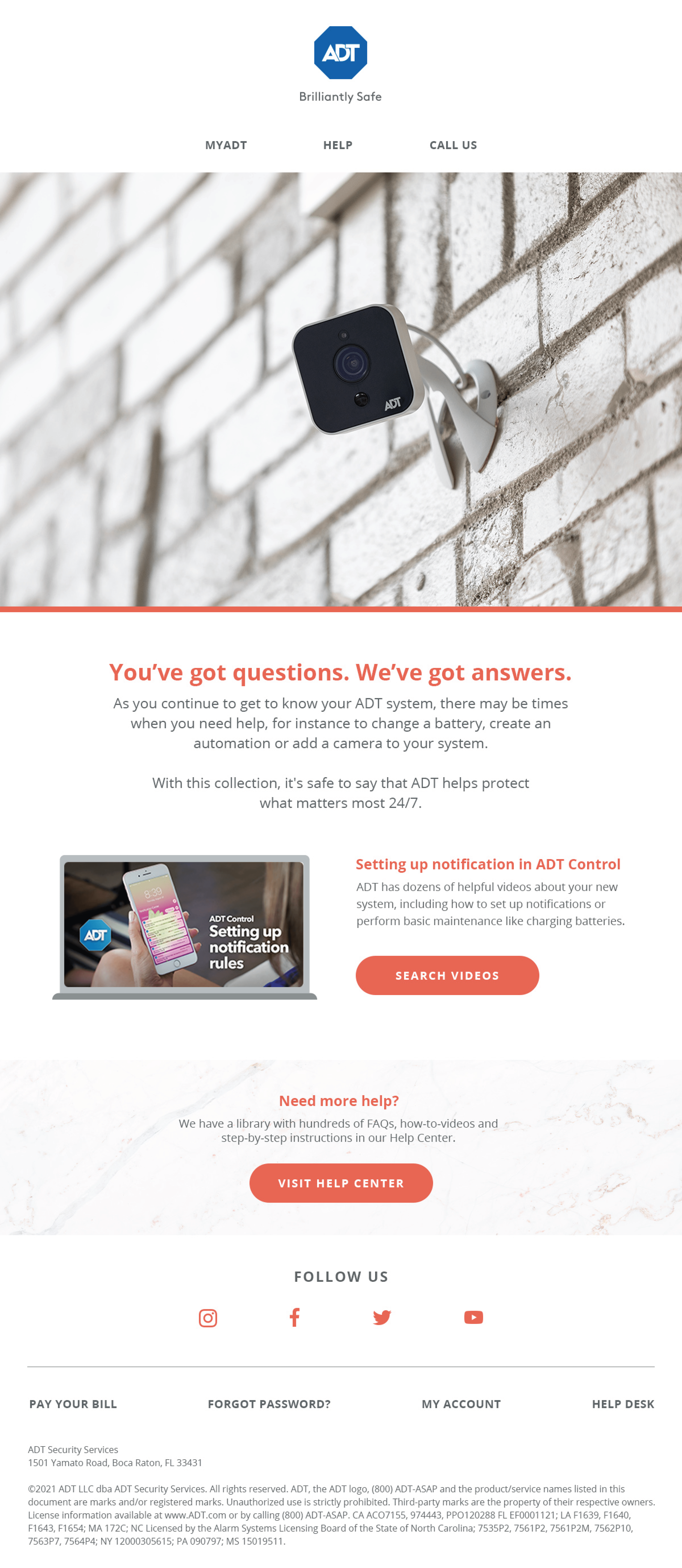
NEW EMAIL SYSTEM
WEB + ICON SYSTEM


Icons designed as Brand Icons would have a 192px version that’s print-friendly with more details included and a 24px version that’s mobile-friendly, with minimal detail but keeping important elements in. A keyline grid was created for both sizes so that any future icons created are in the proper size.

And to give our teams more creative freedom, brand color versions were developed to be leveraged based on needs.

COLLABORATORS
Steve Levy, Creative Director
Jeff Sobul, Copywriting
Bernie Nguyen, Designer